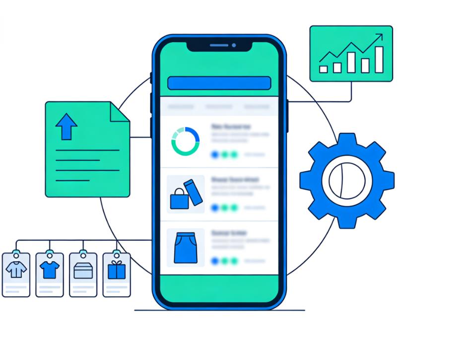
In 2026, mobile commerce (m-commerce) dominates the global eCommerce landscape. According to Statista, mobile devices account for over 65% of all online retail traffic in North America and Europe. Yet surprisingly, most online stores fail to deliver a seamless mobile shopping experience. Even with modern platforms like Shopify, WooCommerce, and BigCommerce, a shocking number of stores still underperform on mobile, resulting in lost conversions, high bounce rates, and lower customer loyalty.
This article explores why mobile optimization is often misunderstood, the common mistakes online stores make, and actionable strategies to get it right.
The State of Mobile eCommerce in 2026
Mobile shopping is no longer optional—it’s the standard. Across Europe and the United States:
- Average mobile conversion rates hover around 1.8–2.5%, compared to 3–4% on desktop.
- Mobile users abandon carts at a rate of 85%, significantly higher than desktop users.
- Slow load times and poor navigation are cited as the top reasons for mobile abandonment.
Despite this evidence, many stores treat mobile as an afterthought. Why?
Common Mobile Optimization Mistakes
Treating Mobile as a Shrunk-Down Desktop
Many merchants mistakenly believe responsive design alone is enough. True mobile optimization requires mobile-first thinking.
- Navigation issues: Mega menus and dropdowns designed for desktops are cumbersome on touch screens.
- Content density: Desktop layouts often cram too much content, forcing mobile users to scroll endlessly.
- Forms and checkout: Tiny buttons and long forms frustrate users, leading to abandoned carts.
Ignoring Mobile Page Speed
Page speed is crucial on mobile, where connections can be slower. Google’s Core Web Vitals show that a one-second delay in mobile load time can reduce conversions by up to 20%. Common speed killers:
- Large images and uncompressed media.
- Heavy third-party scripts, such as chat widgets and pop-ups.
- Inefficient JavaScript and CSS.
Overcomplicating Checkout
Mobile users prefer simplicity and speed. Complicated checkout flows are a major conversion killer:
- Multi-page checkouts without progress indicators.
- Mandatory account creation before purchase.
- Lack of mobile-friendly payment options like Apple Pay, Google Wallet, or PayPal One Touch.
Why These Mistakes Persist
Even in 2026, several factors contribute to subpar mobile experiences:
- Lack of mobile-first mindset: Teams focus on desktop UX because they assume it’s more “serious.”
- Legacy platforms: Some eCommerce platforms still use templates that are not truly mobile-optimized.
- Insufficient testing: Mobile usability testing is often neglected, leaving friction points undiscovered.
Real-Life Examples
Fashion Retailer with High Bounce Rate
A mid-sized US fashion store reported a 70% bounce rate on mobile despite strong desktop performance. Issues included:
- Desktop-optimized images too large for mobile.
- Pop-ups covering the first visible screen.
- Small, hard-to-tap checkout buttons.
After redesigning the mobile experience—compressing images, simplifying the menu, and implementing one-tap payment—the bounce rate dropped to 45%, and conversions increased by 27%.
European Electronics Store
A German electronics store noticed mobile users spent half as much time browsing as desktop users. Problems:
- Long product specification tables not optimized for mobile.
- Related products buried below the fold.
- Slow-loading JavaScript widgets caused 5+ seconds of lag.
By reformatting specs into collapsible sections, prioritizing high-converting content above the fold, and removing unnecessary scripts, mobile revenue increased by 33% within three months.
Principles of Effective Mobile Optimization
Mobile-First Design
Design decisions should start with the mobile user:
- Clear hierarchy: Present important content first.
- Touchable targets: Buttons and links should be at least 44px × 44px.
- Readable fonts: Minimum 16px for body text.
Speed and Performance
Optimize for fast mobile loading:
- Compress images (WebP format recommended).
- Use lazy loading for below-the-fold content.
- Minimize third-party scripts and track performance using Google PageSpeed Insights or Lighthouse.
Streamlined Checkout
Simplify mobile checkout:
- Single-page checkout when possible.
- Social login or guest checkout options.
- Mobile payment integration for frictionless purchases.
Touch-Friendly Navigation
Replace desktop-centric elements:
- Hamburger menus, sticky footers, and swipe-friendly sliders.
- Avoid hover-dependent features—touch devices cannot trigger hover states.
Tools and Technologies
- Shopify Mobile Themes: Optimized for responsive, mobile-first UX.
- AMP (Accelerated Mobile Pages): Speeds up mobile page loading.
- Hotjar & Crazy Egg: Mobile heatmaps and session recordings.
- Google Mobile-Friendly Test: Identify technical issues.
Emerging Trends in Mobile eCommerce
Progressive Web Apps (PWAs)
PWAs combine app speed with website accessibility, offering:
- Offline browsing
- Push notifications
- App-like UX without downloads
Brands like Starbucks and AliExpress leverage PWAs to boost mobile engagement and repeat purchases.
Voice Search and Conversational Commerce
With voice assistants rising, stores should optimize for:
- Voice-friendly product descriptions
- Conversational chatbots for mobile queries
Augmented Reality (AR) Integration
AR lets mobile shoppers visualize products in real-life settings, reducing purchase hesitation. Popular in furniture, fashion, and cosmetics.
Key Takeaways
- Mobile optimization is not just responsive design—it’s mobile-first thinking.
- Speed, usability, and simplicity directly impact mobile conversions.
- Testing and monitoring are critical—use heatmaps, session recordings, and analytics.
- Emerging technologies like PWAs, AR, and voice search provide a competitive edge.
Stores that prioritize mobile usability today will dominate in 2026 and beyond.
In a mobile-first world, merchants cannot afford to get mobile optimization wrong. Every interaction—from navigation to checkout—must be fast, frictionless, and intuitive. By adopting mobile-first design principles, streamlining checkout, and leveraging emerging technologies, stores can boost conversions, reduce cart abandonment, and build long-term loyalty.
Leave a Reply